Overview
Acquia has partnered with a third-party email builder to provide MassiveHand Campaign Works™ users with a smooth experience for creating templates and emails. To access this new email builder, select a template or theme on the Templates tab and click Builder. To use this builder, you don’t need to have any HTML or CSS knowledge and can use the drag-and-drop interface to build emails that are Outlook-friendly and mobile responsive.
The new email builder consists of two primary parts:
- the main message editing staging on the left
- the properties panel on the right
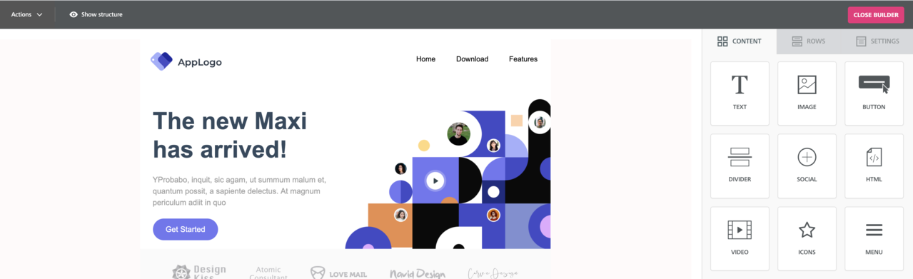
To customize a template, you can drag and drop the various content blocks and rows onto the staging area on the left and edit the properties for each row and content block.
The properties panel on the right consists of the following sections:
- Content: Use this section to select and edit the specific content blocks that make up your message. For example, buttons, images, text blocks, etc.
- Rows: Use this section to select different structural blocks (for example, a single-column vs. three-column row) to organize your content. You can add content blocks to these rows.
- Settings: Use this section to define various overall settings that affect the entire message or template. For example, a default font family.
Note
When creating a new email, start with the Settings tab to set general options for the email, add rows, and then add content blocks to your message.
Content
The Content section allows you to select new content blocks and add it to your email message.
The available content block types are:
- Title block
- Text block
- Image block
- Button block
- Divider block
- Social block
- HTML block
- Video block
- Icons block
- Menu block
- Dynamic Content block
The Content section provides the following functionalities:
- To use a new content block, drag the block from the Content section on the right and drop it to the staging area on the left.

- To view the properties of a specific content block, select the block. The system opens the Content Properties section for the specific content block on the right. Properties are different for the various content block types.
- To move a specific content block, drag the block to another location within the staging area.

- To remove or clone a content block, use the corresponding icons for the content block in the staging area on the left. Alternatively, you can select a content block and use these icons in the Content Properties section on the right.

- To navigate to the content block selector section from the Content Properties section, select the downward arrow next to the copy icon.

- To modify the properties for a content block, click the specific block. The system displays the Content Properties sections on the right.

Title block
With the Title block, you can define the sections of your email while improving accessibility. Screen readers and other accessibility tools can identify the sections with H1, H2, and H3 headings.
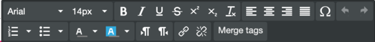
The first row of the toolbar contains the following options:
- Bold
- Italic
- UnderlineIf you decide to underline the title and want the underline to have:
- same color as the title: apply the underline before changing the color.
- different color than the title: set the color of the title as the color that you want the underline to have, apply the underline, and change the title color.
- Strikethrough
- Superscript
- Subscript
- Text colorUse the default color palette or click Custom to use the color picker, an RGB code, or a hex code.
- Background color: Use the default color palette or click Custom to use the color picker, an RGB code, or a hex code.
The second row of the toolbar contains the following options:
- Insert or edit a link
- Link Type:
- URL: Opens a web page.
- E-MAIL: Sends a message to the specified address; options to add a subject and message.
- File Manager: Links to an asset in the file manager.
- Tel: Makes a call to the specified phone number.
- SMS: Sends a text message to the specified phone number.
- Url/Email/Number: The address of the URL, email, or telephone number.
- Underline link: To underline the text for the link, select this check box.
- Text to display: The text that should appear as a link in the email.
- Title: Text that appears when the recipient hovers over the link.
- Target: Open the link in a new browser tab or the current tab.
- Link Type:
- Remove link
- Merge tags: Use this option to select the field you’d like to use as a token.
The general section within Content Properties has the following parameters:
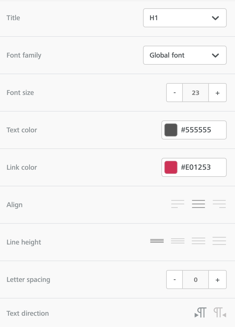
- Title: Select the heading level for the title. The available options are H1, H2, and H3.
- Font family: Select the font family for the title text. If you select Global font, the system applies the font selected for Default font in the Settings section.
- Font size: Select the size of the title text.
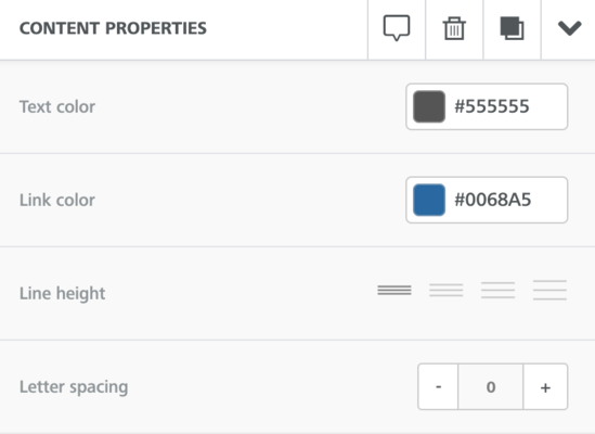
- Text color: Select the text color for the content in the title block. You can select your preferred color from the color picker or specify a hex code. To change the color of a portion of the text in the block, use the formatting toolbar.
- Link color: Select the color for any links added in the title block. You can select your preferred color from the color picker or specify a hex code. To change the color of a specific link in the block, use the formatting toolbar.
- Align: Select the alignment of the title from the available options.
- Line height: Select the spacing between lines within the text block. The available options are 1.2, 1.5, 1.8, 2.0. These options are not adjustable.
- Letter spacing: Specify the space that you want to apply between individual letters in the title block.
- Text direction: Select the direction in which the title text must display.
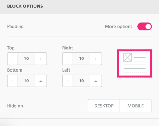
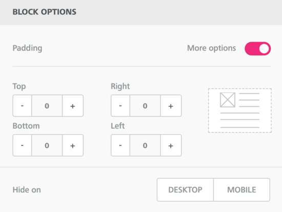
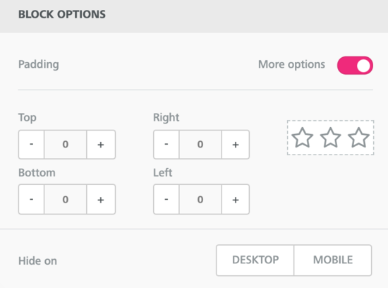
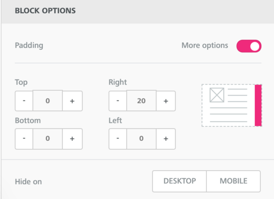
The Block Options section has the following parameters:
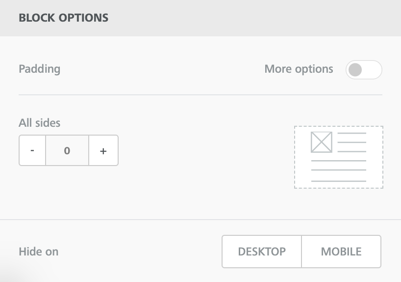
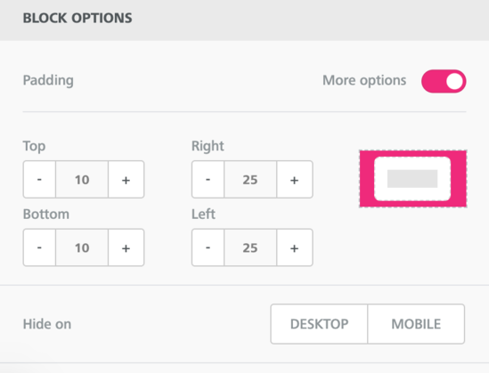
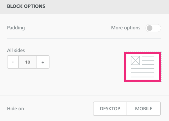
- Padding: To enable uniform space between the content and the edge of the column, set the padding value in All sides. Alternatively, to set unique padding values for the different sides, enable the More options toggle bar and specify the padding values for top, right, left, and bottom.
- Hide on: To hide content on either Desktop or Mobile, select the device type where the content needs to be hidden.
Text block
Use the Text content block to insert textual content in your emails. MassiveHand Campaign Works™’s text editor toolbar allows you to modify various properties for the textual content, such as font family, font size, basic formatting, text alignment, numbered and non-numbered bullets, font color, links, etc. Some of these options are also available for the text editor of the Button block.
The first row of the toolbar contains the following options:
- Font typeIf you select Global font, the system applies the font selected for Default font in the Settings section.
- Font size
- Bold
- Italic
- UnderlineIf you decide to underline the text and want the underline to have:
- same color as the text: apply the underline before changing the color.
- different color than the text: set the color of the text as the color that you want the underline to have, apply the underline, and change the text color.
- Strikethrough
- Superscript
- Subscript
- Clear formatting
- Align-left
- Align-center
- Align-right
- Align-justified
- Insert a symbol/special character
- Undo previous change
- Redo previously undone change
The second row of the toolbar contains the following options:
- Ordered lists
- Default (1, 2, 3, etc.)
- Lower Alpha (a., b., c., etc.)
- Lower Greek (lower-case symbols for alpha, beta, gamma, etc.)
- Lower Roman (i., ii., iii., etc.)
- Upper Alpha (A., B., C., etc.)
- Upper Roman (I., II., III., etc.).
- Unordered list
- Default (which is a disc)
- Circle (○)
- Disc (●)
- Square (■)
- Font color (using the default color palette or click Custom to use the color picker, an RGB code, or a hex code)
- Text Background/Highlight Color (using the default color palette or click Custom to use the color picker, an RGB code, or a hex code)
- Text direction – left to right
- Text direction – right to left
- Insert or edit a link
- Link Type:
- URL: Opens a web page.
- E-MAIL: Sends a message to the specified address; options to add a subject and message.
- File Manager: Links to an asset in the file manager of the third-party email builder.
- Tel: Makes a call to the specified phone number.
- SMS: Sends a text message to the specified phone number.
- Url/Email/Number: The address of the URL, email, or telephone number.
- Underline link: To underline the text for the link, select this check box.
- Text to display: The text that should appear as a link in the email.
- Title: Text that appears when the recipient hovers over the link.
- Target: Open the link in a new browser tab or the current tab.
- Link Type:
- Remove a link
- Add a merge tag/token (opens a menu to select the field you’d like to use as a token)
Note
To add the webview or unsubscribe URL tokens as links, use the URL type and enter {webview_url} or {unsubscribe_url} as the URL. To use the default text and link from your configuration settings, use the {webview_text} or {unsubscribe_text} tokens.
The general section within Content Properties has the following parameters:
- Text color: Select the text color for the content in the block. You can either select a color of your choice from the color picker or specify a hex code. To change the color of a portion of the text in the block, use the formatting toolbar.
- Link color: Select the color for any links added in the content block. You can select your preferred color from the color picker or specify a hex code. To change the color of a specific link in the block, use the formatting toolbar.
- Line height: Select the spacing between lines within the text block. The available options are 1.2, 1.5, 1.8, 2.0. These options are not adjustable.
- Letter spacing: Specify the space that you want to apply between individual letters in the text block.
The Block Options section has the following parameters:

- Padding: To enable uniform space between the content and the edge of the column, set the padding value in All sides. Alternatively, to set unique padding values for the different sides, enable the More options toggle bar and specify the padding values for top, right, left, and bottom.
- Hide on: To hide content on either Desktop or Mobile, select the device type where the content needs to be hidden.
Image block
Use the Image content block to display images on emails. For the image block, the general section within Content Properties has the following parameters:
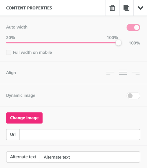
- Auto width: To adjust the image width automatically based on screen size or use the original image width, enable this toggle bar. Alternatively, disable the toggle bar and select a percentage of the column width to occupy with the image.
- Full width on mobile: To ensure that the image occupies the entire width in a mobile device, enable this toggle bar. This option is available only when you disable the Auto width toggle bar.
- Align: Select the alignment of the button from the available displayed options.
- Dynamic image: To set a dynamic image, enable this toggle bar and set the value for Dynamic Url. For more information, see dynamic images.ImportantWhen using dynamic images, you must replace the personalized values or merge tags with the tokens in MassiveHand Campaign Works™’s format. For example, if the third-party email builder documentation mentions
{{firstname}}, you must replace that with{contactfield=firstname}to add a first name value on the image. - Change image: To upload a new image, click this option to select the new image from the file manager. Alternatively, specify the location where the image is located in Url.ImportantIn the Safari browser, you won’t be able to select images from the file manager due to browser restrictions. To avoid this issue, you can paste the image URL in Url or drag and drop the image file directly in the Image content block. However, if you want to use the file manager, use a browser other than Safari.
- Apply effects and more: This option appears once you have aded an image, Click this opens to open a photo editor with options for:
- Filter: Apply one or more filters from the available options:
Grayscale, Black & White, Sharpen, Invert, Vintage, Polaroid, Kodachrome, Technicolor, Brownie, Sepia, Remove Color, Brightness, Gamma, Noise, Pixelate, Blur, Emboss, and Blend. - Resize: Resize the width and height with options to maintain aspect ratio and use percentages rather than pixels.
- Crop: Crop the image by specifying width, height, predefined aspect ratios, or using a manual selector.
- Transform: Rotate the image clockwise or counterclockwise, flip vertically or horizontally.
- Draw: Use a brush to draw on the image.
- Text: Overlay text on top of the image.
- Shapes: Overlay shapes on top of the image.
- Stickers: Overlay stickers on top of the image.
- Frame: Add one of the nine predefined frames around the edges of the image.
- Corners: Round the edges of the image.
- Filter: Apply one or more filters from the available options:
- Alternate text: Specify an alternate text for the image. This text appears if the recipient cannot view the image for whatever reason. Examples may include the image not rendering, there’s an error from the source, or if they are using a screen reader.NoteDon’t forget to include a value for alternate text to improve accessibility and deliverability.
The Action section has the following parameters:
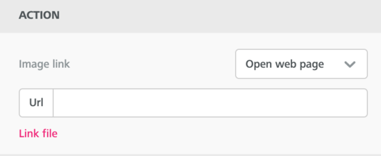
- Image link: Select the behavior of the button from the available options:
- Open web page
- Send email
- Make call
- Send SMS
The Block Options section has the following parameters:
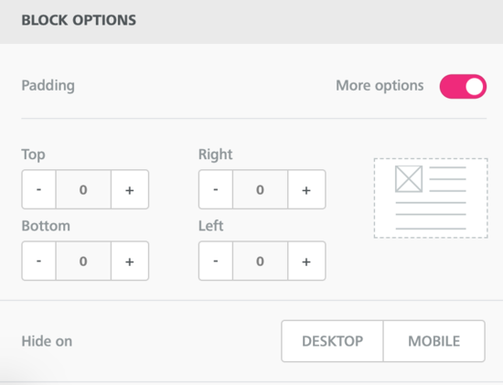
- Padding: To enable uniform space between the content and the edge of the column, set the padding value in All sides. Alternatively, to set unique padding values for the different sides, enable the More options toggle bar and specify the padding values for top, right, left, and bottom.
- Hide on: To hide content on either Desktop or Mobile, select the device type where the content needs to be hidden.
Button block
Use the Button content block to display actionable buttons on the emails. Once the recipient clicks the button, the system redirects the user to the link that you have configured.
MassiveHand Campaign Works™ provides a text editor to update the textual content of the button. The behavior of this text editor is similar to that of the Text block. For more information, see Text block.
For the button block, the Action section has the following parameters:
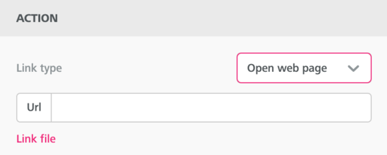
- Link type: Select the behavior of the button from the available options:
- Open web page
- Send email
- Make call
- Send SMS
{assetlink=ID#}. You must replace ID# with the ID number of the asset. If you use the Link file option, the system pulls files from the file manager and not trackable assets in MassiveHand Campaign Works™.
The Button Options section has the following parameters:
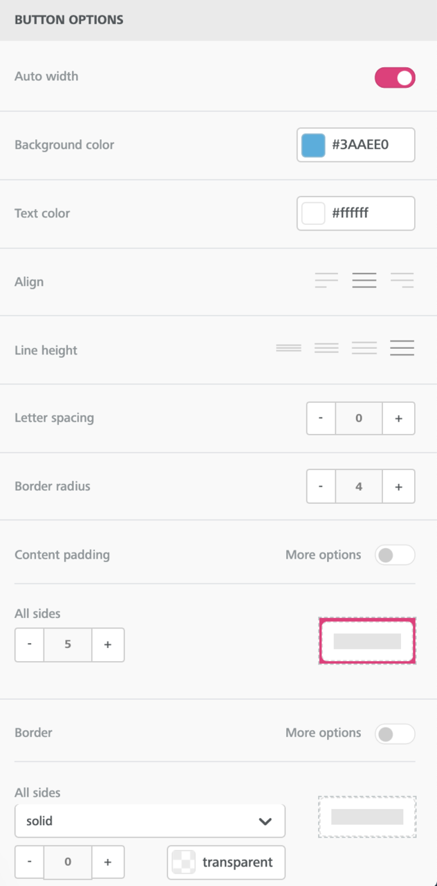
- Auto width: To enable the button to adjust its width automatically based on the internal padding of the button and the length of the text on the button, enable this toggle bar. Alternatively, disable the toggle bar and select the percentage of the column width that you’d like the button to occupy (in increment of 5%).
- Background color: Select the background color for the button. You can either select a color of your choice from the color picker or specify a hex code.
- Text color: Select the text color for the content. You can either select a color of your choice from the color picker or specify a hex code.
- Align: Select the alignment of the button from the available displayed options. This option doesn’t set the alignment of the text within the button.
- Line height: Select the height of the line from the available options: 1.2, 1.5, 1.8, 2.0. These options are not adjustable.
- Letter spacing: Specify the space that you want to apply between individual letters in the content of the button block.
- Border radius: Select the radius for the border of the button. Use this option to define how rounded the corners of the button should be. A higher number means a rounder edge.
- Content padding: To set identical space between the text and the edge(s) of the button for all sides of the button, disable the More options toggle bar and set the padding value for all sides.Alternatively, to set custom padding for all four sides, enable the More options toggle bar and set unique padding values for the different sides.
- Border: To set identical border for all sides of the button, disable the More options toggle bar, select the border type, and set the border width for all sides. Use this option to add a solid, dotted, or dashed line at the edge(s) of the column, with a selected weight and color.Alternatively, to set custom borders for all four sides, enable the More options toggle bar, select the border type, and set the border width for all sides.
The Block Options section has the following parameters:
- Padding: To enable uniform space between the content and the edge of the column, set the padding value in All sides. Alternatively, to set unique padding values for the different sides, enable the More options toggle bar and specify the padding values for top, right, left, and bottom.
- Hide on: To hide content on either Desktop or Mobile, select the device type where the content needs to be hidden.
Divider block
Use the Divider content block to separate various rows clearly. Using this block, you can add spacing above or below content within a row or column, or separate blocks clearly with a line. For the divider block, the general section within Content Properties has the following parameters:
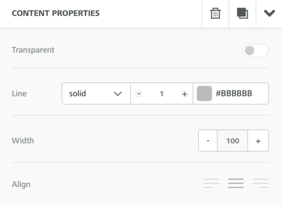
- Transparent: To configure the divider to be transparent, enable this toggle bar.
- Height: Specify the height for the divider. This option is available only if the Transparent toggle bar is enabled.
- Line: Specify the type of line (solid, dotted, dashed) as well as the color of the divider. This option is available only if the Transparent toggle bar is disabled.
- Width: Specify the width of the divider. This option is available only if the Transparent toggle bar is disabled.
- Align: Select the alignment of the divider from the available displayed options. This option is available only if the Transparent toggle bar is disabled.
The Block Options section has the following parameters:
- Padding: To enable uniform space between the content and the edge of the column, set the padding value in All sides. Alternatively, to set unique padding values for the different sides, enable the More options toggle bar and specify the padding values for top, right, left, and bottom.
- Hide on: To hide content on either Desktop or Mobile, select the device type where the content needs to be hidden.
Social block
Use the Social content block to include social share, social follow, and other link icons in your platform. The available options are:
- Social follow:FacebookTwitterInstagramLinkedInYouTubePinterestVkontakteOdnoklassnikiBloggerMediumTumblrSoundCloudSpotifyVimeoSinaWeiboGlassdoorSnapchatTelegramWechat
- Social share:FacebookTwitterLinkedInVkontakteOdnoklassnikiqZoneSinaWeibo
- Other:
- Website link
For the social block, the general section within Content Properties has the following parameters:
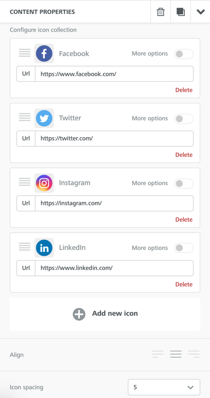
- Select icon collection: Select the style of the social icons you want to use in your email. If your desired icon style doesn’t exist, you may select any collection and use custom icons. Alternatively, you can use the Icons block type. For more information, see Icons block.
- Configure icon collection: Customize the social icons that you want to display. MassiveHand Campaign Works™ displays a standard set of icons, such as Facebook, Twitter, Instagram, and LinkedIn. To add a link to another platform, choose Add new icon. To further customize each icon, enable the More options toggle bar and update the name of an icon, set alternate text, and add the link to the relative page for your brand.You can also delete any icon or change the order of the icons by grabbing the stacked lines with your mouse and dragging into the desired order.To create a custom social platform icon, click Add a custom icon and define the following additional parameters:
- Change image: To upload a new image for the icon, click this option and select the new image from the file manager.
- Apply effects & more: To update the icon, click this option. You can apply various special effects on the icon.
- Align: Select the alignment of the social icons from the available displayed options.
- Icon spacing: Select the spacing for the social icons. Available options are 0, 5, 10, 15, and 20.
The Block Options section has the following parameters:
- Padding: To enable uniform space between the content and the edge of the column, set the padding value in All sides. Alternatively, to set unique padding values for the different sides, enable the More options toggle bar and specify the padding values for top, right, left, and bottom.
- Hide on: To hide content on either Desktop or Mobile, select the device type where the content needs to be hidden.
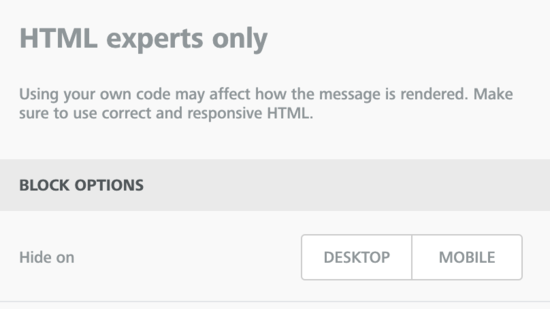
HTML block
Important
Use this option only if you are an HTML expert. Ensure to include code for mobile responsiveness and for Outlook-friendliness, particularly if you’re including images or buttons.
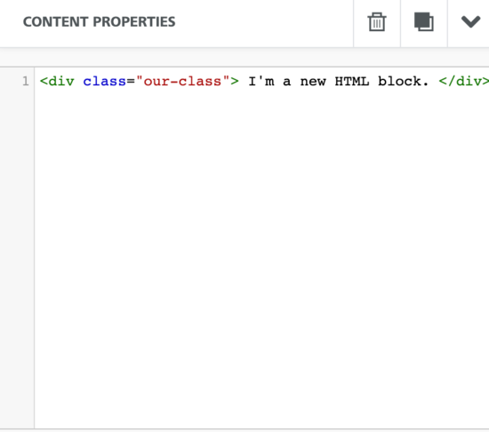
Use the HTML content block to add your own custom HTML to an email message. For the HTML block, the Content Properties section has a text area where you can specify your entire HTML code. You can use this content block to add live content from different sources (for example, dynamic ads, personalized maps).
Once you start using the HTML editor, it will automatically correct any issue that might arise due to incorrect tags or HTML tags that are not closed.
The allowed tags are:
a, abbr, acronym, address, area, b, bdo, big, blockquote, button, caption, center, cite, code, colgroup, dd, del, dfn, dir, div, dl, dt, em, fieldset, font, form, h1, h2, h3, h4, h5, h6, i, ins, kbd, label, legend, li, map, menu, ol, optgroup, option, p, pre, q, s, samp, select, small, span, strike, strong, sub, sup, table, tbody, td, textarea, tfoot, th, thead, u, tr, tt, u, ul, var
The allowed attributes list:
- general attributes:
style, id, class, data-*, title - a:
href, name, target - img:
align, alt, border height, hspace, src, vspace, width, usemap - table:
align, bgcolor, border, cellpadding, cellspacing, width - tbody:
align, valign - td:
align, bgcolor, colspan, height, rowspan, valign, width - tr:
align, bgcolor, valign - tfoot:
align, valign - th:
align, bicolor, colspan, height, rowspan, valign, width - thead:
align, valign - li:
type - map:
name - area:
alt, coords, href, shape, target
Preheader Text
You can use the HTML block type to add preheader text at the beginning of the email. Such text appears in the preview for a message in a recipient’s inbox, but isn’t displayed in the body of the email.
Add an HTML block at the very top of the message in the new email builder and copy and paste the following code into the code editor:
<!-- Visually Hidden Preheader Text : BEGIN -->
<div style="display:none;font-size:1px;line-height:1px;max-height:0px;max-width:0px;opacity:0;overflow:hidden;mso-hide:all;font-family: 'Raleway',sans-serif;">This is preheader text</div>
<!-- Visually Hidden Preheader Text : END -->
Important
Ensure that you replace This is preheader text with whatever you’d like your preheader text to be.
The Block Options section has the following parameter:
- Hide on: To hide content on either Desktop or Mobile, select the device type where the content needs to be hidden.
Video block
Use the Video content block to share videos through emails.
Important
- To get the best possible result, refrain from linking to password-protected videos.
- MassiveHand Campaign Works™ doesn’t embed the actual video in the email, but only links to the video.
For the video block, the general section within Content Properties has the following parameters:
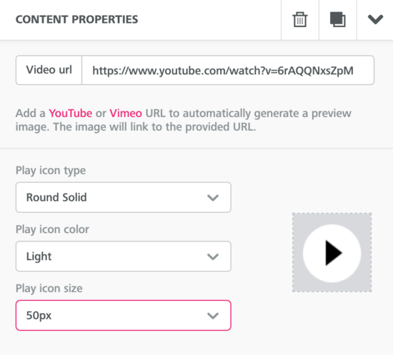
- Add a video url: To share video content easily through your emails, click this option and specify the link for your Youtube or Vimeo video in Video url.NoteThe video block type only supports YouTube and Vimeo videos. To link to a video from another service, insert an image with a link to the video.
- Play icon type: Select the type in which the play icon should be displayed. The available options are:
- Round solid
- Round outline
- Rectangle
- Rectangle outline
- Square
- Square outline
- Arrow only
- Play icon color: Select whether the play icon should be light or dark.
- Play icon size: Select a size for the icon. Some of the available options are 50px, 55px, 60px.
The Block Options section has the following parameters:
- Padding: To enable uniform space between the content and the edge of the column, set the padding value in All sides. Alternatively, to set unique padding values for the different sides, enable the More options toggle bar and specify the padding values for top, right, left, and bottom.
- Hide on: To hide content on either Desktop or Mobile, select the device type where the content needs to be hidden.
Icons block
Use the Icons content block to create icons on your email. The icon block offers more flexibility than some other block types, as it is not restricted by row structures. For example, visual bullet lists, ratings, properties, logo galleries, etc.
For this block, the general section within Content Properties has the following parameters:
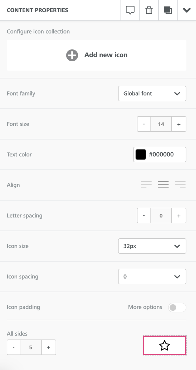
- Configure icon collection: To add an icon and define the properties for the icon, click Add new icon. If you do so, the following additional properties are displayed:
- Change image: To upload a new image for the icon, click this option and select the new image from the file manager.
- Apply effects & more: To update the icon, click this option. You can apply various special effects on the icon.
- If you add multiple icons and you need to change the order of the icons, use the drag option.
- To remove unwanted icons, click Delete for the corresponding icon.
- To further customize the icon behavior, enable the More options check box and specify the following attributes:
- Image Url: Specify the URL where the icon is located.
- Alternate text: Specify the alternate text for the icon.NoteDon’t forget to include a value for alternate text to improve accessibility and deliverability.
- Icon text: Specify the text to accompany the icon, if desired. Once you’ve entered text, you’ll see options to place the text at the top, right, bottom, or left of the icon.
- Link type: Select the behavior of the link from the available options:
- Open web page
- Send email
- Make call
- Send SMS
- Font family: Select the font family for the text of the icon. If you select Global font, the system applies the font selected for Default font in the Settings section.
- Font size: Select the size of the icon text.
- Text color: Select the color for the icon text. You can either select a color of your choice from the color picker or specify a hex code.
- Align: Select the alignment of the icon from the available options.
- Letter spacing: Specify the space that you want to apply between individual letters in the textual content of the icon block.
- Icon size: Select a size (square height and width of the icon) for the icon. Available options are 16px, 32px, 64px, 128px.
- Icon spacing: Select the spacing for the icon. Available options are 0, 5, 10, 15, and 20.
- Icon padding: To enable space between the icon and anything else next to it, enable this check box and specify the padding values for top, right, left, and bottom.
The Block Options section has the following parameters:
- Padding: To enable uniform space between the content and the edge of the column, set the padding value in All sides. Alternatively, to set unique padding values for the different sides, enable the More options toggle bar and specify the padding values for top, right, left, and bottom.
- Hide on: To hide content on either Desktop or Mobile, select the device type where the content needs to be hidden.
Menu block
Use the Menu content block to create menu items on your email. For this block, the general section within Content Properties has the following parameters:
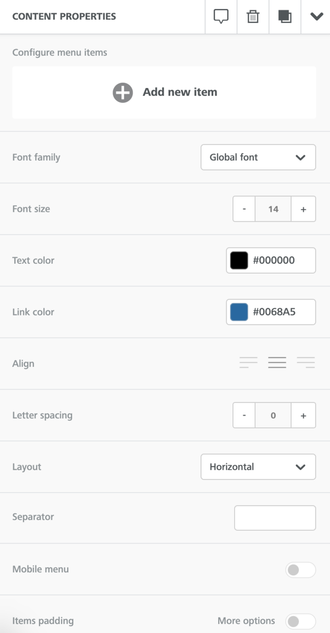
- Configure menu items: To add a menu item and define the properties for the menu, click Add new item. If you do so, the following additional properties are displayed:
- Text: Specify the text to indicate the menu item.
- Link type: Select the behavior of the link from the available options:
- Open web page
- Send email
- Make call
- Send SMS
- Title: Specify the text that must appear when a recipient hovers over the menu item in the email.
- Target: Specify if a user; who clicks the menu item; needs to be navigated to a different page or the same page.
- Font family: Select the font family for the text of the menu item. If you select Global font, the system applies the font selected for Default font in the Settings section.
- Font size: Select the size for the font of the menu text.
- Text color: Select the color for any non-linked text in the menu. You can either select a color of your choice from the color picker or specify a hex code.
- Link color: Select the color for any linked text in the menu. You can either select a color of your choice from the color picker or specify a hex code.
- Align: Select the alignment of the menu item from the available options.
- Letter spacing: Specify the space that you want to apply between individual letters in the menu block.
- Layout: Select if the menu items should be displayed horizontally or vertically.
- Separator: Select the separator for the menu items.
- Mobile menu: To customize the menu items appearance for mobile devices, enable this toggle bar and specify the values for icon size and type, foreground and background color. This option adds a hamburger menu on mobile devices, with options for icon size (24px, 36px, 48px, 64px), foreground color (the color of the hamburger lines, set using the color picker or a hex code), icon type (normal/square or rounded), and background color (set using the color picker or a hex code).
- Items padding: To set space between items in the menu, enable this check box and specify the padding values for top, right, left, and bottom.
Note
- To add more menu items, click Add new item and specify the above properties.
- To remove unwanted menu items, click Delete for the corresponding menu item.
The Block Options section has the following parameters:
- Padding: To enable uniform space between the content and the edge of the column, set the padding value in All sides. Alternatively, to set unique padding values for the different sides, enable the More options toggle bar and specify the padding values for top, right, left, and bottom.
- Hide on: To hide content on either Desktop or Mobile, select the device type where the content needs to be hidden.
Dynamic Content block
The Dynamic Content block enables you to configure different content to appear to different recipients, based on data on the recipient’s contact record in MassiveHand Campaign Works™.
To configure dynamic content:
- Add a Dynamic Content block to your staging area on the left.

- Click Configure to actually create the content.The system displays a WYSIWYG editor. This is similar to the text slot type in the Legacy builder. For more information, see text.

- In Default, configure the content that needs to be sent to any contacts whose profile data doesn’t meet the filters set on any of the variations.
- Click +New to add as many variations as you’d like and define the content for each variation.

- In the Variation <number> tabs, set the filters that determine the audience you’d like to send each variation to. Based on the number of variations, the value of <number> is populated.You can use the logical operators like or and and to create a single variation using multiple filters.For example, if you want to send promotional emails to users of specific domains within a certain region, you can create filters to define emails and regions and use the and operator. Hence, contacts within those regions and with those domains will receive such emails.
Rows
The Rows section allows you to separate the content area to multiple rows, where each row can have unique structures. Thus, you can have rows that allow you to organize content that is different from the preceding and the subsequent rows.
For example, you may want:
- a single-column row with an image to introduce your online store’s new promotion
- a two-column row below it to display some of the store’s best-selling products
The Rows section provides the following functionalities:
- To use a new row structure, drag and drop an appropriate row type to the message staging area on the left. All such row types have different number of columns.

- To move a specific content block, select the block and use the drag icon. Additionally, you can clone or remove specific content blocks and not the entire row that may contain multiple content blocks.
 Similarly, you can also drag a row and place it in another location within the staging area. Additionally, you can clone or remove rows.
- To configure your email templates quickly, you can clone entire rows along with all the content blocks. For example, a picture and a button. Additionally, you can also delete entire rows along with all the content blocks.

- To view the row or column properties, click the row. The system displays the Row Properties and Column Properties sections on the right.

- To update properties for a specific row, click the row and modify the values in the Row Properties section. At the row level, you can update:
- Row background color: Specify the background color for the row. Use the color picker or enter a hex code for the desired background color of the row.
- Content background color: Specify the background color for the content. Use the color picker or enter a hex code for the desired background color of the content area within the row. This color will be only behind your content, up to the set content area width. Space beyond the edges of the content area background is filled with the Row background color.
- Do not stack on mobile: To maintain the row structure, even on smaller screens, enable this toggle bar. By default, rows with multiple columns are stacked as individual rows on mobile devices.
- Reverse stack order on mobile: To reverse the columns’ stacking order on mobile, enable this toggle bar.
- Row background image: Select an image to appear behind the content in the row. You can set the image to go the full width of the row, to repeat, and/or to be centered.
- Display condition: More documentation on this feature is coming soon.
- Customize Columns: Once you have dragged a row structure into the stage, you may click the Add new button to add another column to the row. Additionally, you can adjust the width of the columns. Each row is split up into twelve (12) pieces, and each column must be at least two (2) pieces wide. In all, each row may have up to six (6) content blocks. Drag the grabber between any two columns to the left or right to adjust the widths of the columns as desired.

- To update properties for a specific column, click the row that contains the column and modify the values in the Column Properties section for the specific column. If a row contains multiple columns, navigate to the correct column before modifying any values. At the column level, you can update:
- Column background: Specify the background color for specific columns within a row. Use the color picker or enter a hex code for the desired background color of the column.
- Padding: Define the space between the content and the edge(s) of the column. To set individual padding, enable the More options toggle bar.
- Border: Use this option to add a solid, dotted, or dashed line at the edge(s) of the column, with a selected weight and color. To set custom border on different sides, enable the More options toggle bar.

- You can save a row of content and reuse the same in multiple emails. For more information, see Saving content rows.
Settings
The Settings section allows you to modify the general settings that apply to the entire message.
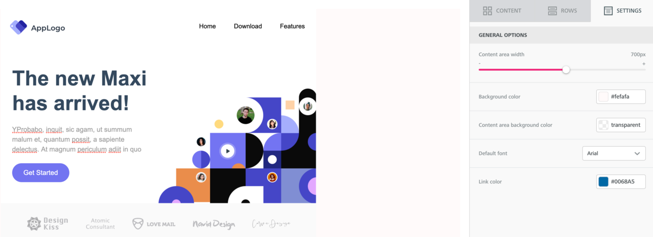
The available parameters are:
- Content area width: Select the width of the area where you can drag and drop content blocks. You can specify the width from 480px to 900px. Per email marketing best practices, Acquia recommends you to set this value to 600px or less.NoteThe selected value is the maximum width that will be used on larger devices, such as Desktop. On smaller devices, the message adjusts automatically.
- Content area alignment: Select the alignment of the whole content area of the email. The available options are LEFT and CENTER.
- Background color: Select the background color for the message. You can either select a color of your choice from the color picker or specify a hex code.NoteThis option is applicable only for rows (and columns) where you haven’t specified a color. Else, the background color specified for that content structure is used.
- Content area background color: Select the background color for the content area. You can select your preferred color from the color picker or specify a hex code.NoteThis option is applicable only for rows (and columns) where you haven’t specified a color. If you’ve specified a background color or content area background color for a content structure, that color is used.
- Default font: Select the default font that you want to use as the Global font when editing text.
- Link color: Select the default link color that must be used when you haven’t specified any other link color. You can either select a color of your choice from the color picker or specify a hex code.
Actions
The new email editor enables in-editor previews and allows you to save an email created with the drag-and-drop editor as a template.
Previewing template
With the new email builder, MassiveHand Campaign Works™ enables you to preview the emails during the editing process. Generic previews are available for desktop and mobile devices. The preview doesn’t show how the message will render in specific email clients.
To preview your template:
- In your new email builder, go to Actions > Preview.This launches the email in the preview mode, showing its current state.

- To preview the template for desktop and mobile, click the respective option.

- To return to editing, click the X icon next to the Mobile option in the top right corner.
Saving templates
If you’d like to save an email in order to use the structure and style as the basis for other emails you’ll be building, the new email editor allows you to save any message as a template.
To save a template:
- In your new email builder, go to Actions > Save as template.This displays the Save As Template pop-up window.

- Specify the Name and click Save Template. The system saves the template in Settings > Themes. If you’re using Campaign Factory, you’ll also be able to copy the template (as a theme) between instances.NoteDo not include periods in the name of your template.
Saving content rows
You can save a row of content and reuse the same in multiple emails. Hence, you can quickly update and manage a row of content used across emails.
To save a row of content:
- In your new email builder, select a row and click the Save icon.

- Specify a name and a category for the row. You can either select an existing category or create a new category (for example, Header, Footer).

- Click Save.
Once you have saved a row, you can use the same in your future emails.
To add a saved row:
- In your new email builder, go to Rows and select the category you saved your row(s) to.

- Drag and drop the saved row into your email.
To update details for a saved row:
- Log in to MassiveHand Campaign Works™.
- Go to Channels > Emails.
- For an existing email, navigate to the Edit Email – <email_name> window. Alternatively, click +New to open the New Template Email or New Segment Email window.

- Click Managed Saved Rows.This displays all the saved rows.
- For the row that you want to update, click Edit.

- Repeat the steps. The changes made reflects in any emails that use the row.
Note
You can also delete a saved row. Deleting a row doesn’t remove it from any emails.
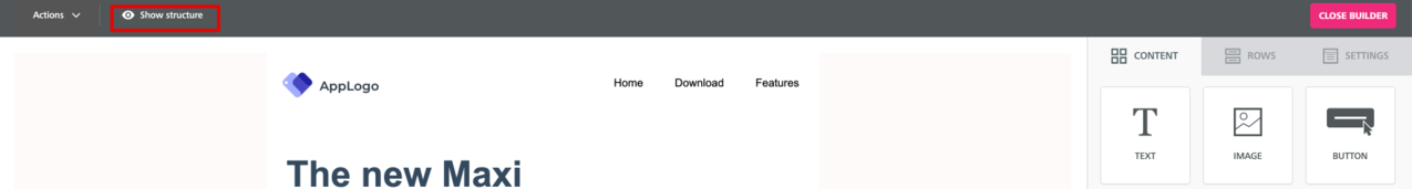
Viewing structure
To view the structure (rows and columns) of the email template in grids, click Show structure.
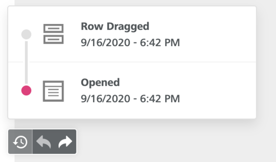
Viewing history
In the bottom left corner of the new email builder, the system displays a tray with three icons.
- To view the history of all the changes on the template, click the first icon. You can click one of the previous versions to revert the editor to the state of the email when that change was made.
- To undo or redo the previous edit, use the other two icons.